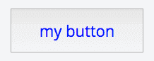

Button
Warning
Rework pending, no delivery date. The Front App SDK (ReactJS) and the Front API SDK (NodeJS) are both being replaced. This page documents the current release, remains accurate, and is maintained until the replacement ships. Code written against it keeps working.
Allows you to add a clickable button with triggers an action in the interface of your dashboard.
Add a Button element
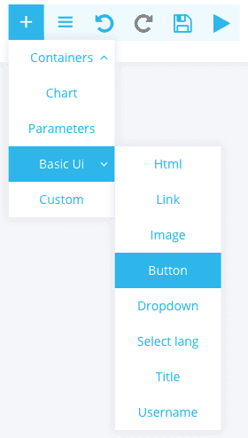
Hover over the section of the dashboard that you willing to edit. Click on the "+" button to get the list of elements you can add, select "Basic UI" and then "Button".
Configure a Button element
Simple configuration
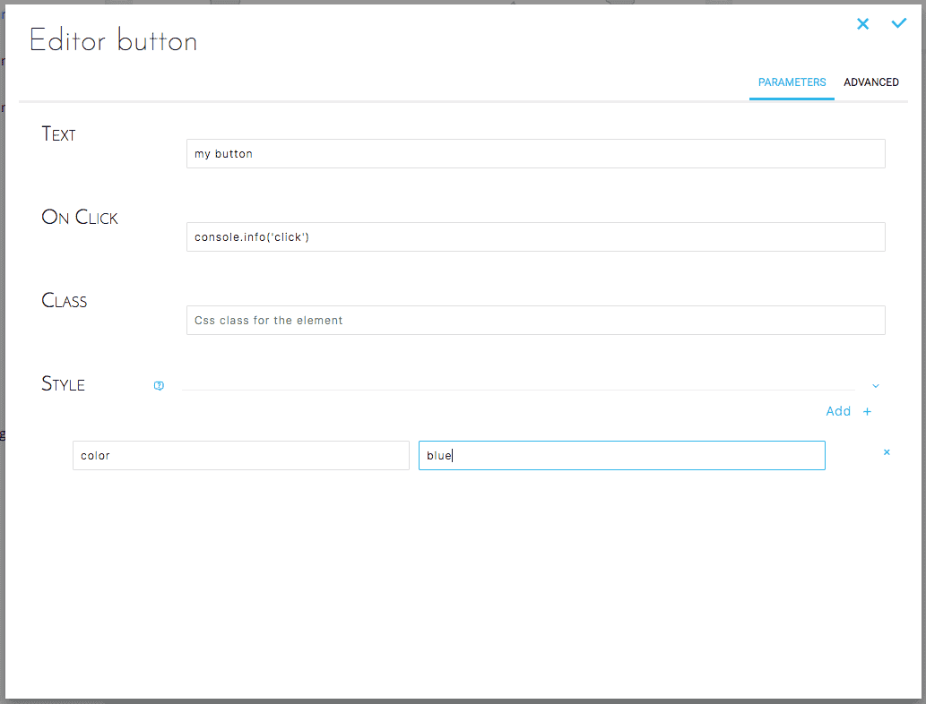
The interface allows you to configure the button in a simple and intuitive way. You can easily edit the following parameters for the button:
- Text: The button text as displayed on the interface for instance "Open Page" or "Next"
- On Click: The action that the click will trigger, this is usually a trigger to open a new dashboard page.
- Class: The CSS class to which the button belongs in case you are applying shared attributes such as for styling.
- Style: Specific styling attributes to apply to the button like the background or text color (see example below).
Advanced configuration
Below is the JSON configuration for a Button as created above :
Result