

FinOps uses case with FOCUS and superset
This guide provides step-by-step instructions on configuring your Data Project to take your first steps inside the FinOps with a FOCUS file
Objective
This guide provides step-by-step instructions on configuring your Data Project to take your first steps inside the FinOps with a FOCUS file.
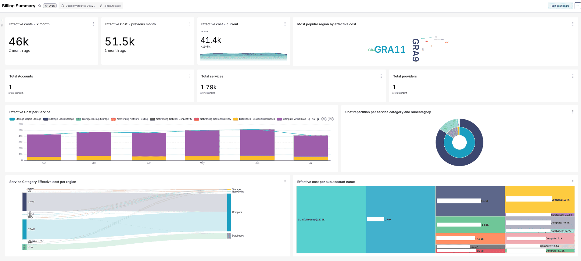
Overview
FOCUS is a specification inside the FinOps world to expose data consumption throughout multiple cloud providers. This guide will provide an example on how to consume this kind of file inside the Data Platform, and leverage the power of superset to create useful dashboards.
Requirements
Before beginning, ensure you have:
- An active OVHcloud account with billing access
Step-by-Step configuration
1. Retrieve the FOCUS file
We need to have a FOCUS formatted file to develop this use case. You can easily extract a CSV file with your OVHcloud account consumption by following this link: OVHcloud Focus Extractor.
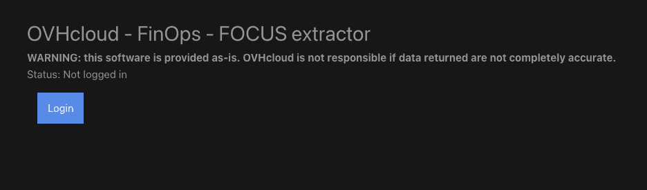
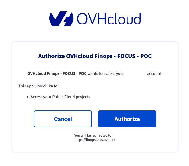
You can login on the interface through the OVHcloud SSO. This tool is a POC developped by our OVHcloud internal team meanwhile we are working to provide a more standard way to extract a FOCUS formatted file.
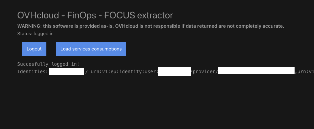
Once logged, you can click on "Load Services Consumption".
When the table is created, you can now click on "Export to CSV" to extract a complete file with your consumption.
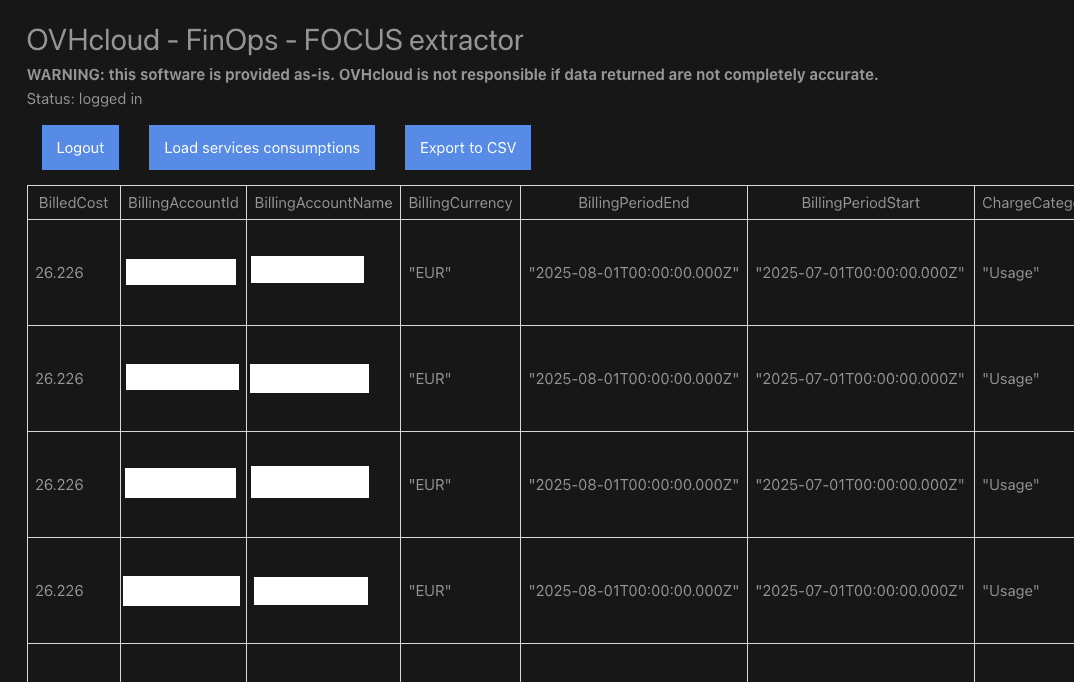
You have now a FOCUS formatted CSV that can be loaded inside the Data Platform
2. Load the FOCUS file inside the Lakehouse
2.1. Create the Data Source
You can now go to the Data Platform, inside the Project of your choice, then Connectors section, and to finish Sources in order to create a new File Upload source.
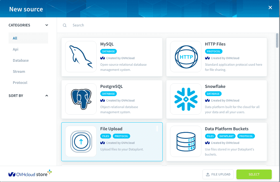
You can name your source focus, and add the export.csv file you downloaded inside the previous step. You can now click on Create.
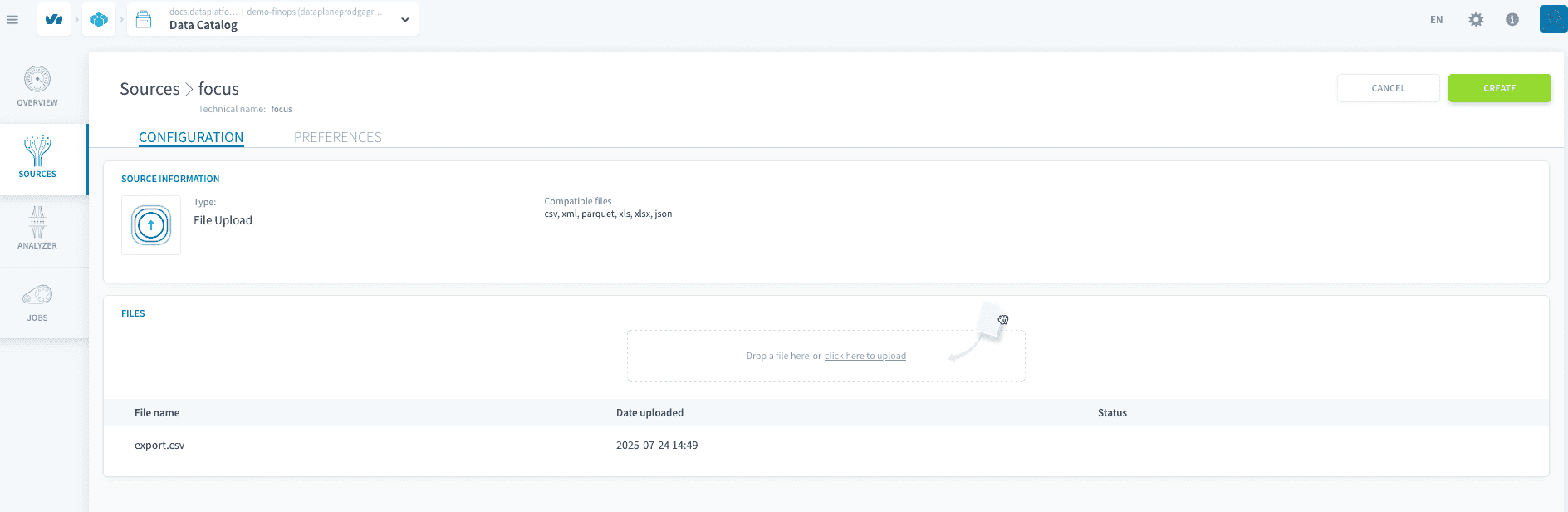
Now the file is loaded, you can go into the Explorer section, and then click on your new source finops and then start the analysis of the file on clicking export.csv. After few seconds, your file should be analyzed successfully.
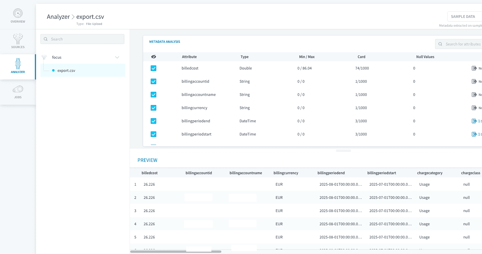
2.3. Load the data into the Lakehouse
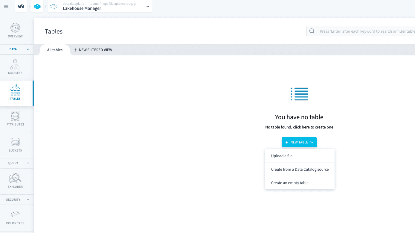
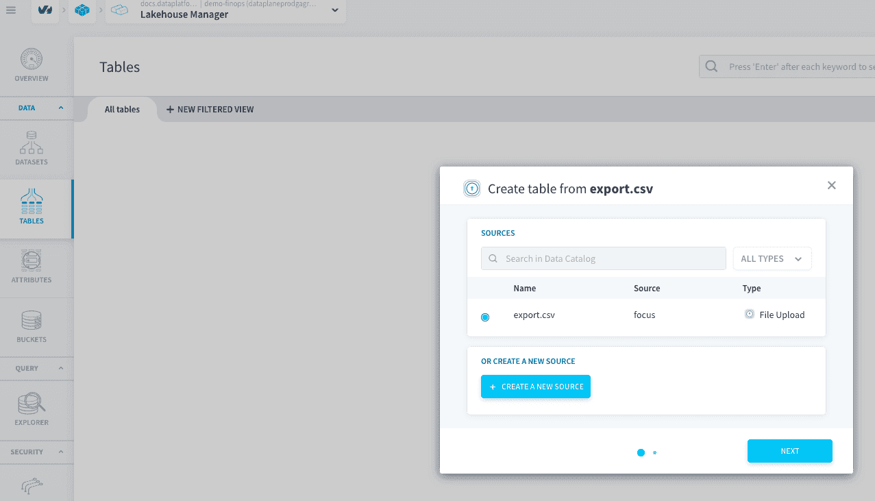
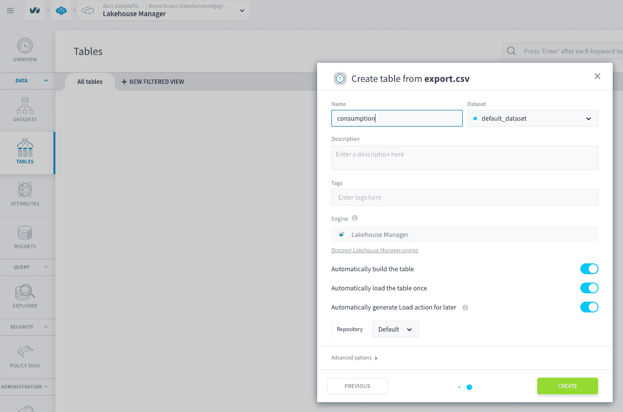
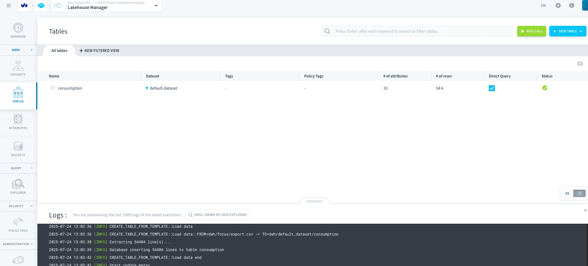
You can now go into the Lakehouse Manager section, and then Tables. You can hit New Table and Create from a Connectors source. Select your export.csv file, then hit next, rename the table into consumption and create.
3. Create the Superset Application
Now all the data is ready to be analyze in the Lakehouse, you need to create the Apache Superset Application. You can do so by following this tutorial.
Considering this tutorial, we consider you followed it until the Step 5: Create your first Chart and until the `3. New Dataset' where you create the Dataset for:
- Database:
trino - Schema:
Default dataset - Table:
consumption
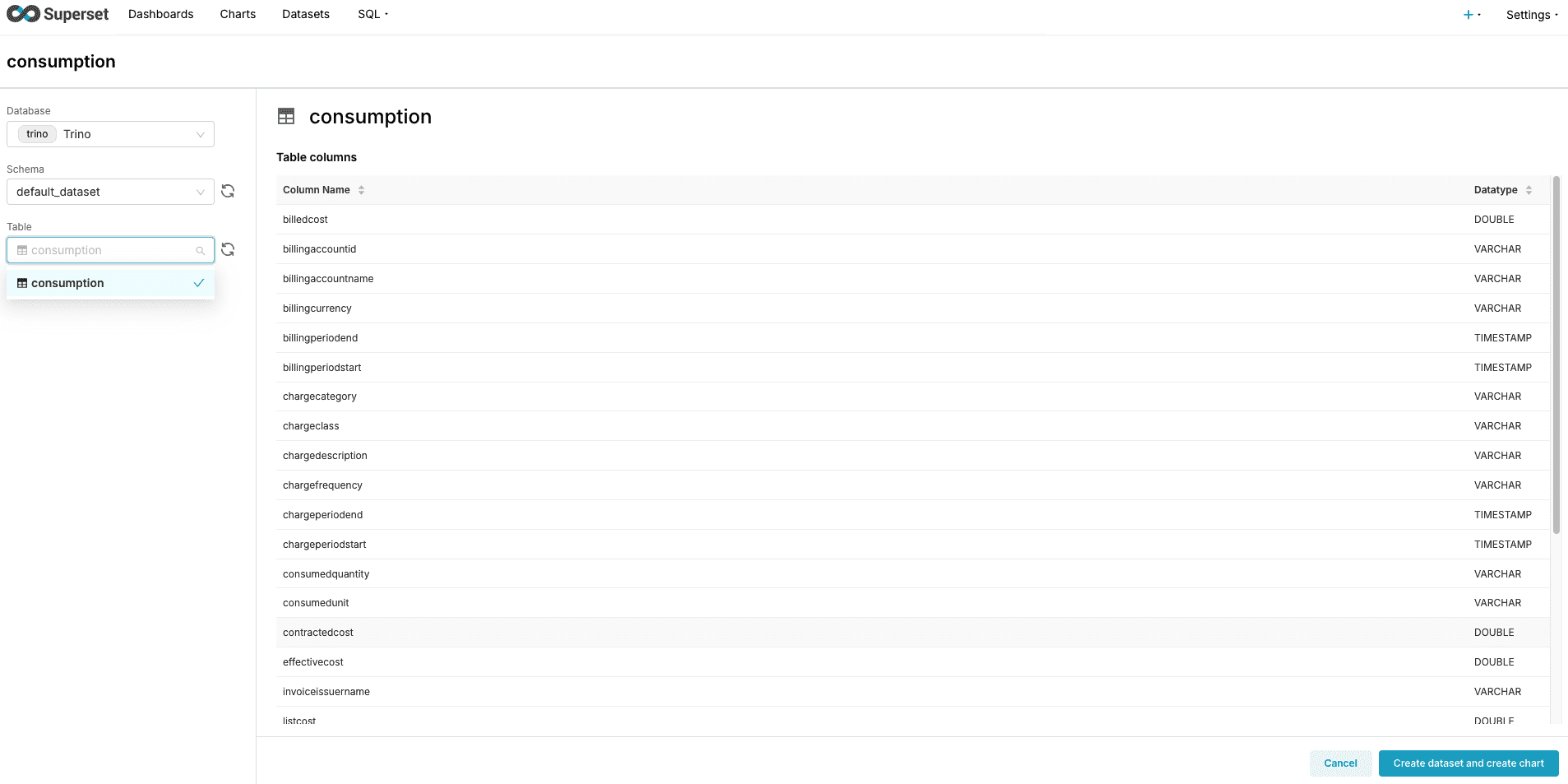
You can now hit Create Dataset and create dashboard
4. Create the Charts
For now, we are going to create multiple charts, always from the same process:
- Click
Charts, then+ Chart - Chose the dataset
consumption
We are going through multiple chart you can create:
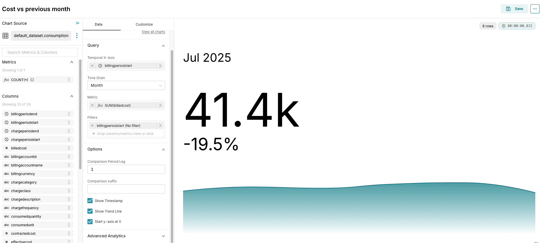
Effective cost - current
- Type:
Big number with Trendline - Temporal axis:
billingperiodstart - Metric:
Billed CostaggregateSUM - Comparison Period Lag:
1 - Show timestamp: true
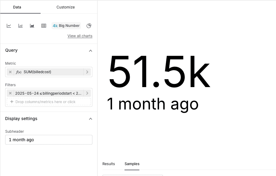
Effective cost - previous month
- Type:
Big number - Metric:
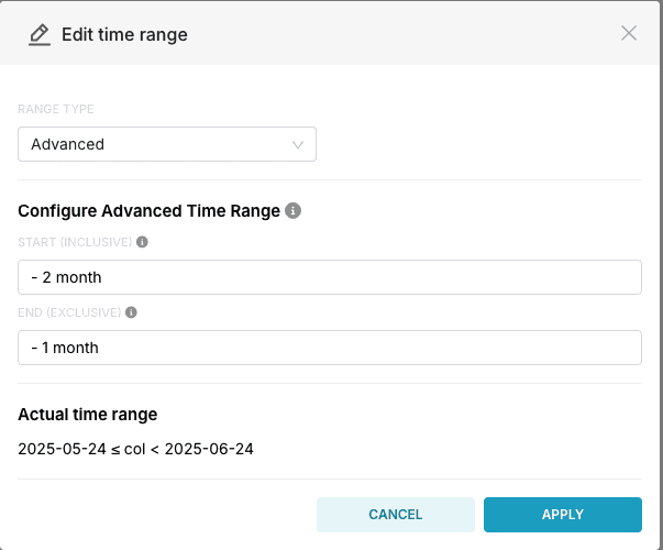
Billed CostaggregateSUM - Filters:
billingperiodstartwithRange type: advancedas per the screenshot - Display settings
- Subtitle:
1 month ago
- Subtitle:
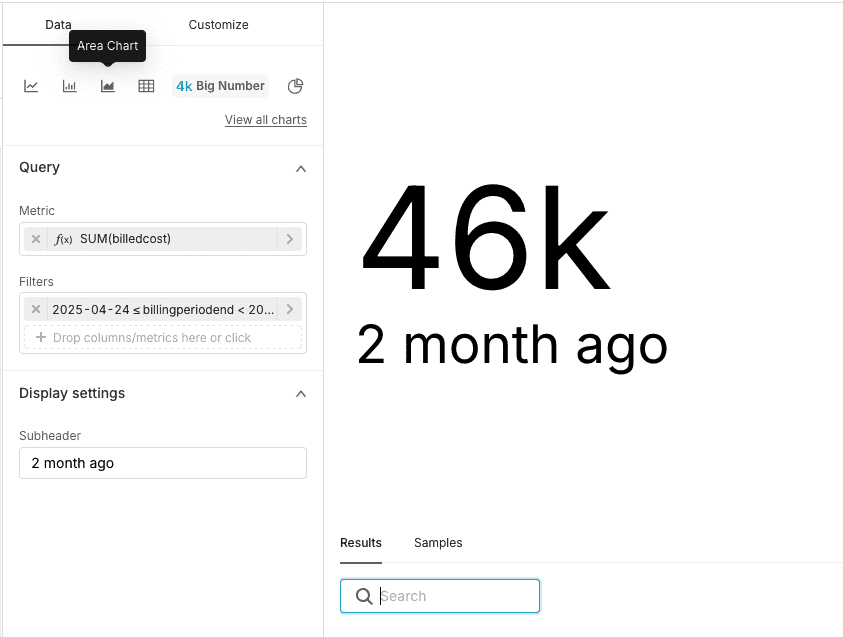
Effective cost - 2 month
- Type:
Big number - Metric:
Billed CostaggregateSUM - Filters:
billingperiodstartwithRange type: advancedand- 3 monthand-2 month - Display settings
- Subtitle:
2 month ago
- Subtitle:
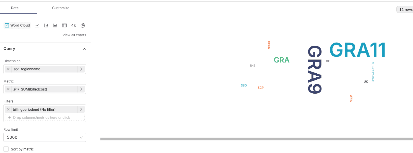
Most popular region by effective cost
- Type:
World Cloud - Dimension:
regionname - Metric:
billedcostwith aggregateSUM
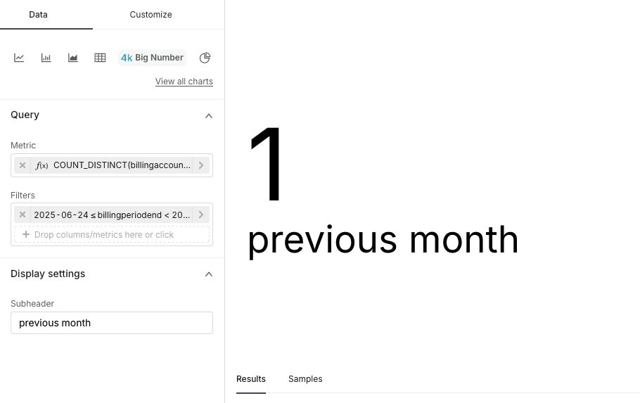
Total accounts
- Type:
Big number - Metric:
billingaccountnameaggregateCOUNT DISTINCT - Filters:
billingperiodstartwithLast Month - Display settings
- Subtitle:
Previous month
- Subtitle:
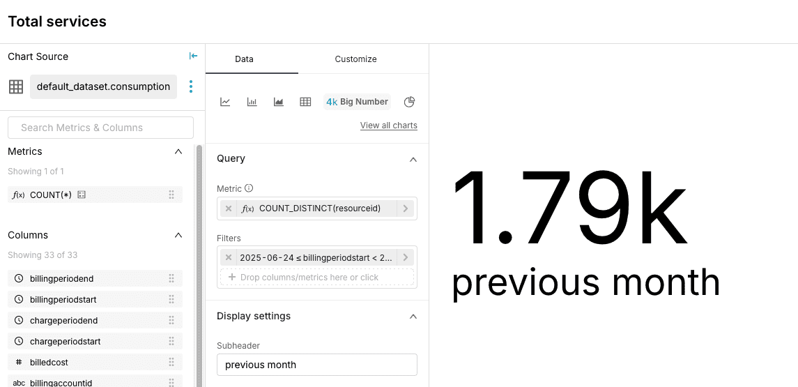
Total services
- Type:
Big number - Metric:
resourceidaggregateCOUNT DISTINCT - Filters:
billingperiodstartwithLast Month - Display settings
- Subtitle:
Previous month
- Subtitle:
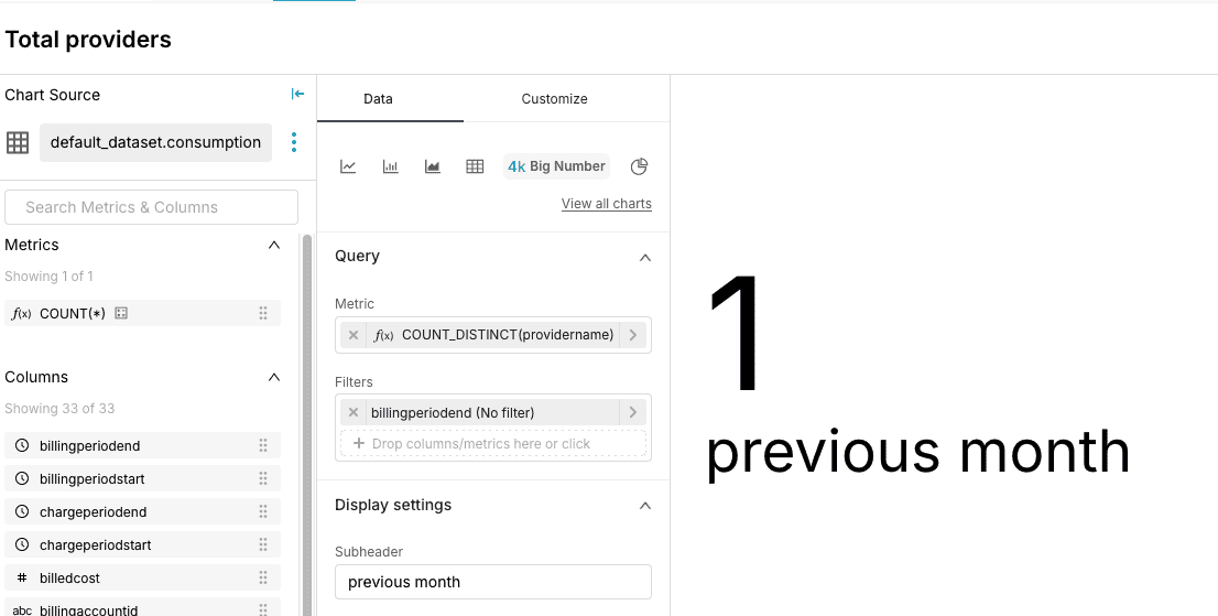
Total providers
- Type:
Big number - Metric:
resourceidaggregateCOUNT DISTINCT - Filters:
billingperiodstartwithLast Month - Display settings
- Subtitle:
Previous month
- Subtitle:
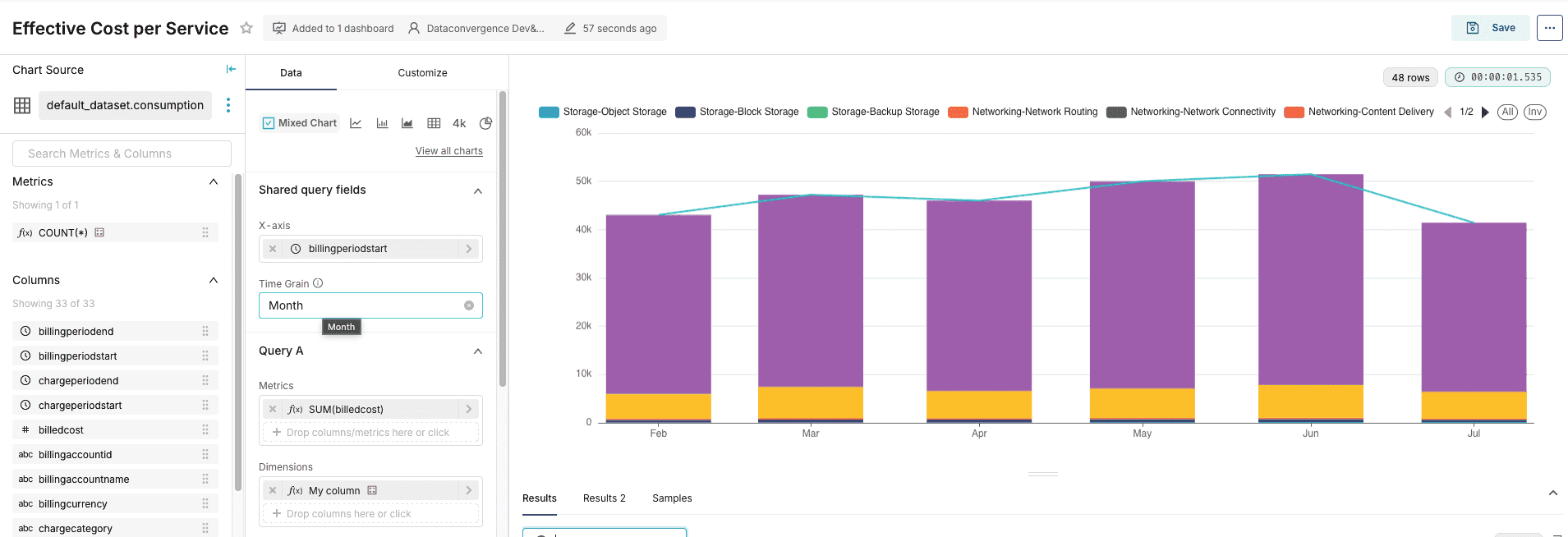
Effective cost per service
-
Type:
mixed chart -
X-Axis:
billingperiodstart -
Time Grain:
Month -
Query A:
- Metrics: 'billedcost' with aggregate 'SUM'
- Dimension:
Custom SQLwithCONCAT(servicecategory, '-', servicesubcategory) - filters:
billingperiodstart
-
Query B:
- Metrics: 'billedcost' with aggregate 'SUM'
- filters:
billingperiodstart
-
Customize:
- Query A:
- Serie type:
Bar - Stack serie:
true
- Serie type:
- Query A:
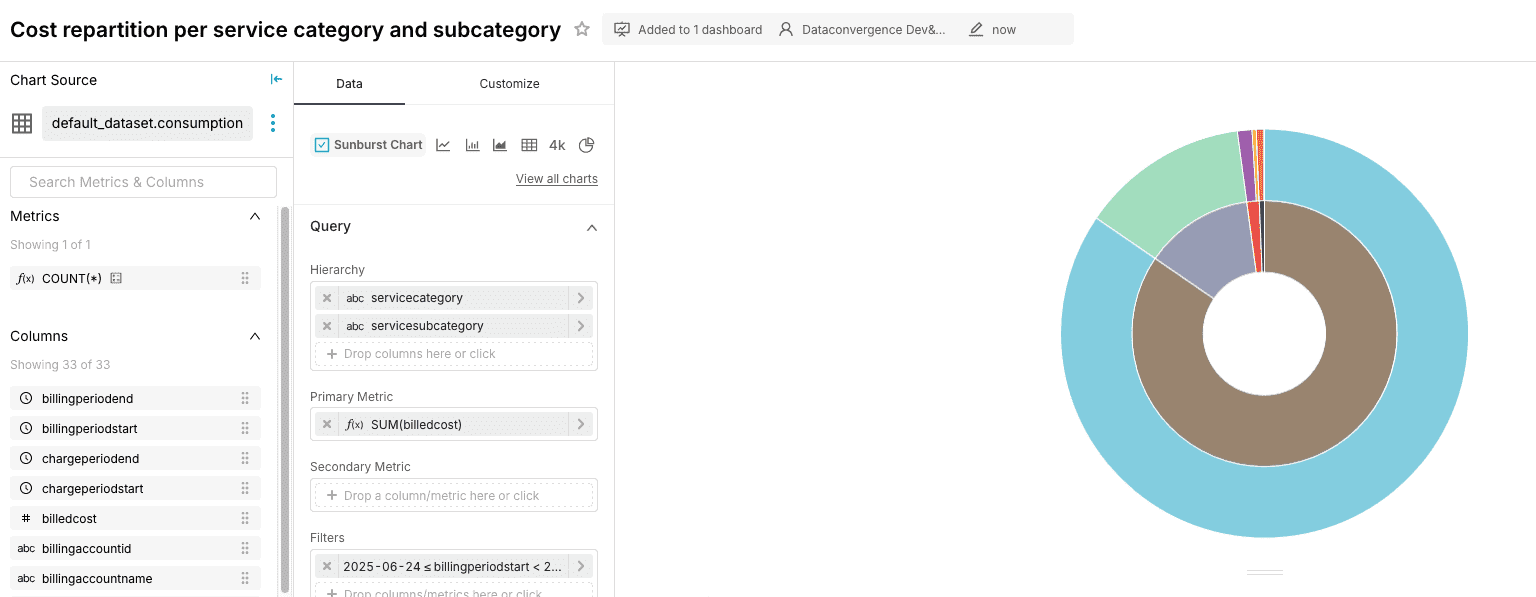
Cost repartition per service category and subcategory
-
Type:
sunburst chart -
hierarchy:
servicecategoryandservicecategory -
primary metric:
billed cost -
Filters:
billingperiodstart: 'Last month'
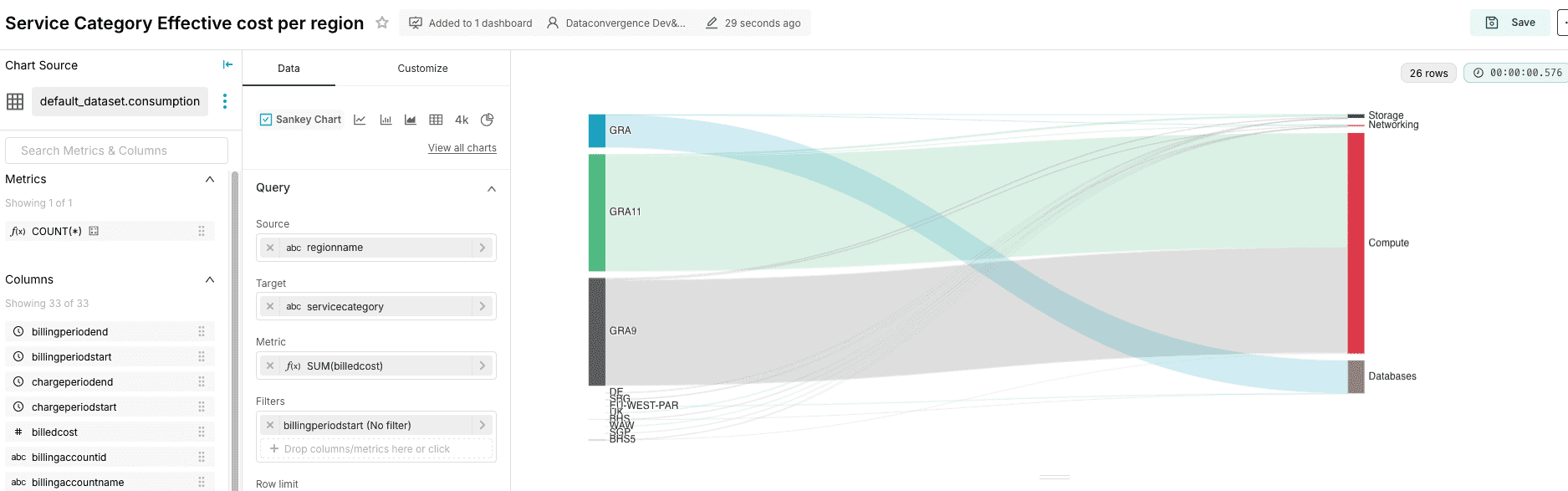
Service Category Effective cost per region
- Type:
Sankey chart - Source:
region name - Target:
servicecategory - Metric:
billedcost - Filters:
billingperiodstart
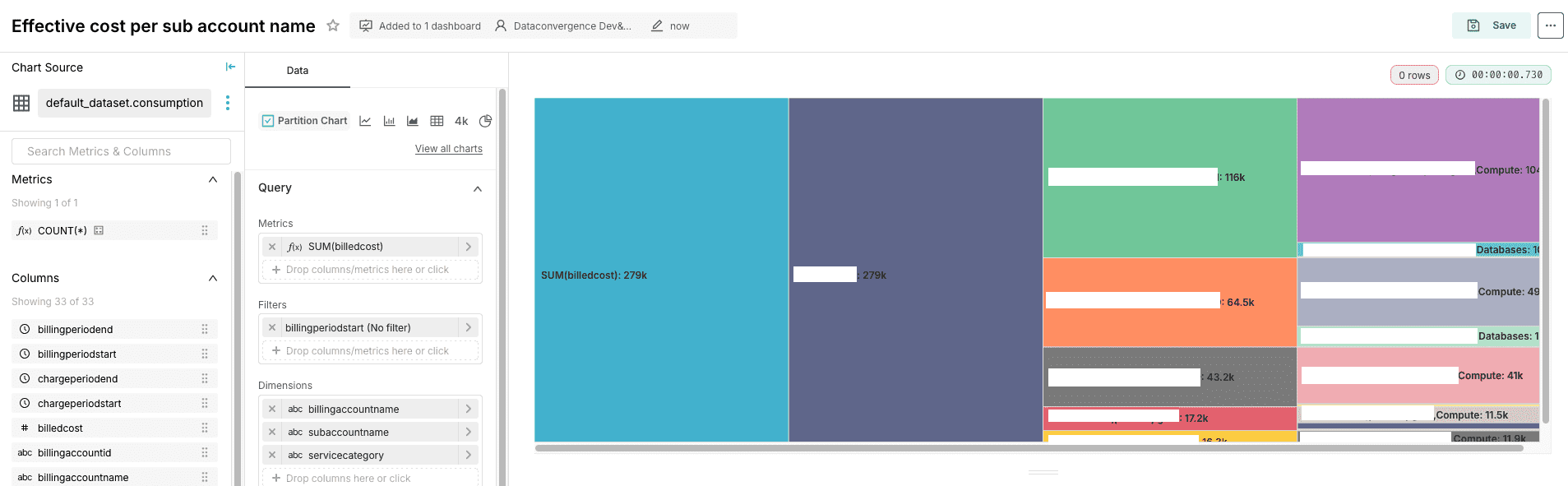
Effective cost per sub account name
- Type:
Partition Chart - Metrics:
billedcostaggregate bySUM - Filters:
billingperiodstart - Dimensions:
billingaccountname,subaccountname,servicecategory
5. Create the Dashboard
Now you have a lot of charts, you can put them together into a single place: the Dashboards. Click on Dashboard, then Create. You can name your dashboard Billing Summary, and drag and drop all the charts you previously created to finalize the view.
Conclusion
By following these steps, you can effectively configure and utilize the OVHcloud Data Platform to implement your first advanced FinOps use case based on the FOCUS format.
Go further
If you need training or technical assistance to implement our solutions, contact your sales representative or click on this link to get a quote and ask our Professional Services experts for a custom analysis of your project.
Ask questions, give your feedback and interact directly with the team building the Data Platform on the dedicated Discord channel.
If you need support with your OVHcloud services, create a request in our Help Centre.
Join our community of users.