

Build the Superset dashboards
This page is the detailed companion to Step 7 of the IoT fleet-monitoring pipeline tutorial
Objective
This page is the detailed companion to Step 7 of the IoT fleet-monitoring pipeline tutorial. It gives the virtual datasets and the exact chart configuration for every panel of the fleet-monitoring dashboard.
Superset queries the Lakehouse through Trino, so all SQL on this page is in the Trino dialect. If you have not deployed Superset yet, follow Deploy Apache Superset first.
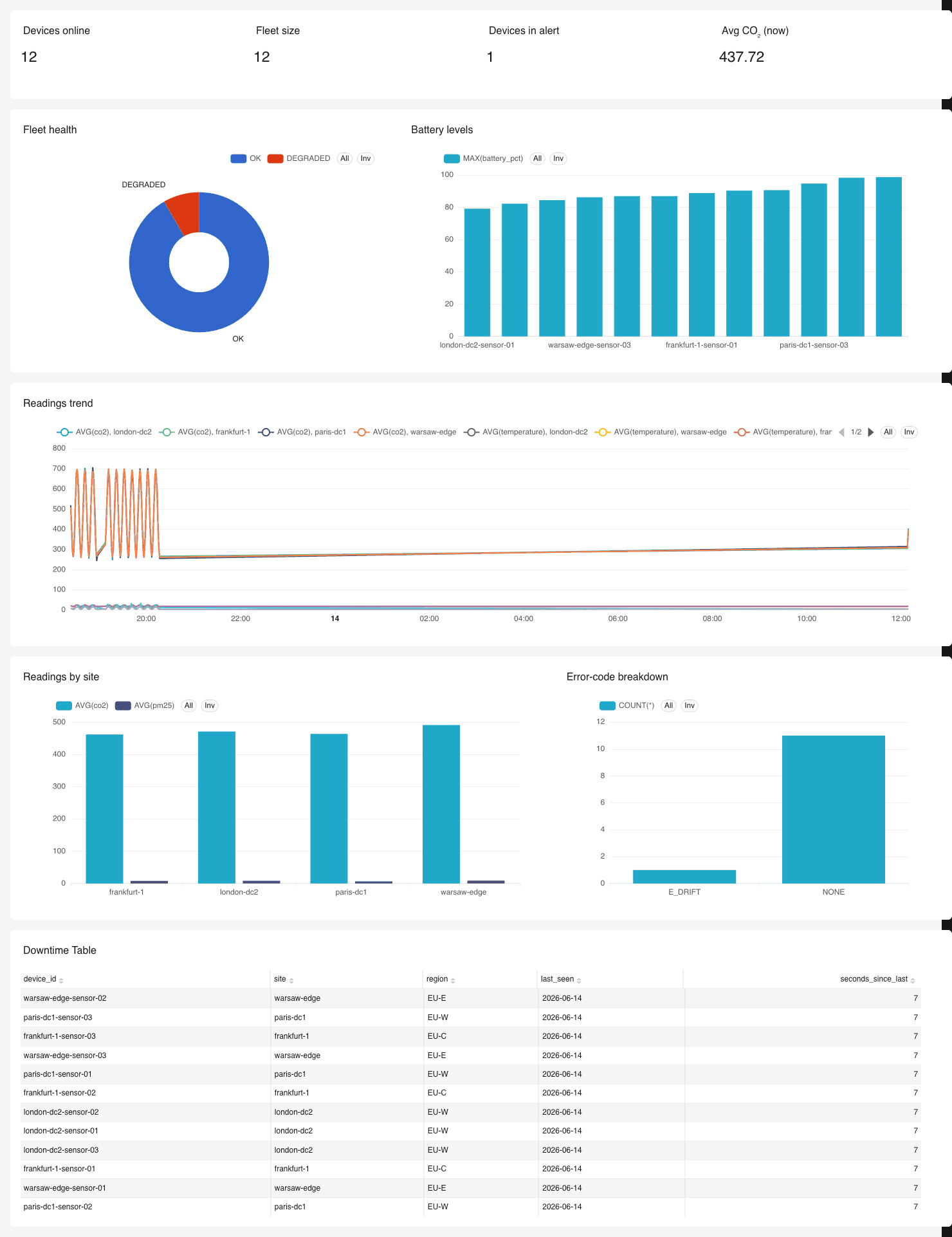
The finished dashboard you will build:
About ts parsing. The producer emits ts as an ISO-8601 string. If the table column is VARCHAR, every query parses it with from_iso8601_timestamp(ts). If you set the column to a real TIMESTAMP in Lakehouse Manager, you can drop the parse and use ts directly. Either way, mark the parsed temporal column as the dataset's main temporal column in Superset so time filters and time-series charts work.
Guard against unparseable rows. If a test message left a record whose ts is not a valid timestamp (for example device_id = 'local-test'), from_iso8601_timestamp throws INVALID_FUNCTION_ARGUMENT: Invalid format. The queries below wrap the parse in try() so that row resolves to null and is filtered out. The clean fix is to purge it once with DELETE FROM iot_readings WHERE device_id = 'local-test', after which the try() wrappers are optional.
Setup
- Connect Trino as a database in Superset under Settings > Database Connections > +. The SQLAlchemy URI has the form
trino://<user>@<trino-host>:<port>/<catalog>. Test the connection before going further. - Add the physical dataset
iot_readingsunder Datasets > +, picking the catalog, schema, and table. - Create the virtual datasets below in SQL Lab (run the query, then Save > Save dataset). The "current state per device" logic is reused by several charts, so save it once as
iot_current_state.
The iot_current_state virtual dataset
This returns the latest row per device, which several panels build on. Save it as iot_current_state.
The inner try() plus WHERE ts_parsed IS NOT NULL drops any unparseable row, which also prevents a bad row from winning the row_number() ordering and being treated as a device's current state.
Panel 1: KPI row
Four headline Big Number charts across the top of the dashboard.
Save the Devices online virtual dataset:
"Online" means reported in the last 2 minutes. This is how an offline device drops out of the count. There is no OFFLINE row to count, only an absence of recent rows.
Panel 2: Fleet health donut
The current status distribution across the fleet, one slice per device rather than per row.
- Chart type: Pie / Donut
- Dataset:
iot_current_state - Dimension:
status. Metric:COUNT(DISTINCT device_id) - Suggested colors: OK green, DEGRADED amber, FAULT red.
OFFLINErarely shows here because offline devices stop emitting, so they fall out of the current state. See Panel 5.
Panel 3: Battery levels
The "you could have seen it coming" chart, sorted so the most at-risk devices are first.
- Chart type: Bar Chart. Bar Orientation Horizontal under Customize.
- Dataset:
iot_current_state - X-axis:
device_id. Metrics:MAX(battery_pct). Leave Dimensions empty. - Sort by
MAX(battery_pct)ascending, row limit 15.
A threshold line at the 15% failure trigger is not available on a categorical bar chart. Annotation layers exist only on time-series charts. To convey the threshold, either rely on the ascending sort so the lowest batteries are obvious, or build this as a Table instead and use Customize > Conditional formatting to colour MAX(battery_pct) red below 15.
On bar charts, put the category in X-axis and leave the Dimensions box empty. Dimensions is only for splitting each bar into sub-series, which you do not want here.
Panel 4: Readings trend
The headline trend: average metrics over time, sliceable by site or region.
- Chart type: Line Chart (time-series)
- Dataset: a dataset whose temporal column is the parsed
ts(see the parsing note at the top). Create a virtual dataset that exposestry(from_iso8601_timestamp(ts)) AS tsand mark it as the main temporal column. - Time grain: 1 minute (or 30 seconds)
- X-axis:
ts. Metrics:AVG(co2),AVG(pm25),AVG(temperature). Dimensions:siteto get one line per site. - Add dashboard filters on
regionanddevice_type.
CO₂ values (around 480) dwarf temperature (around 21) and PM2.5 (around 9) on a shared axis. For all three to be readable, chart CO₂ separately or put the smaller metrics on a secondary Y-axis.
For a per-device anomaly close-up that shows the FAULT stuck-at values and the PM2.5 spike clearly, duplicate this chart, set the series dimension to device_id, and filter to one of the scripted devices:
Panel 5: Downtime table
Detects true downtime: a device whose latest reading is stale because it stopped emitting.
- Chart type: Table
- Dataset: the virtual dataset below
Save this dataset. It returns every device with the time since its last reading, so the panel is never empty:
Then in the Table chart, use Customize > Conditional formatting to colour seconds_since_last red when it is greater than 30.
A threshold of 30 seconds assumes the 5 second emit interval, so a device missing about 6 cycles is considered down. Tune it to taste. If you would rather list only down devices, add HAVING date_diff('second', max(try(from_iso8601_timestamp(ts))), current_timestamp) > 30 to the query. Note that this version is empty when the fleet is healthy, which can look broken in a live demo.
Panel 6: Error-code breakdown
Which kinds of faults are occurring over a window.
- Chart type: Bar Chart
- Dataset:
iot_readings - X-axis:
error_code. Metrics:COUNT(*). Leave Dimensions empty. - Filter:
error_code <> 'NONE'and time range set to the last 15 minutes.
Panel 7: Readings by site
Compare environmental readings across the fleet.
- Chart type: Bar Chart
- Dataset:
iot_current_state - X-axis:
site(orregion). Metrics:AVG(co2),AVG(pm25). Leave Dimensions empty.
As in Panel 4, CO₂ dwarfs PM2.5 on a shared axis. Chart them separately or use a secondary Y-axis if you need both readable.
Dashboard layout
A practical arrangement of the seven panels:
Add dashboard filters for region, site, device_type, and a time range. Set the dashboard auto-refresh interval to 30 seconds (under Edit dashboard) for a live feel.
As the scripted failures play out, the dashboard moves through the whole story: a healthy fleet, a device degrading and faulting, a window of downtime that surfaces in the downtime table and as a gap in the trend, and finally a repair that returns the device to normal.
Go further
If you need training or technical assistance to implement our solutions, contact your sales representative or click on this link to get a quote and ask our Professional Services experts for a custom analysis of your project.
Ask questions, give your feedback and interact directly with the team building the Data Platform on the dedicated Discord channel.
If you need support with your OVHcloud services, create a request in our Help Centre.
Join our community of users.