

For AI agents: the complete documentation index is available at https://docs.dataplatform.ovh.net/llms.txt, the full documentation bundle is available at https://docs.dataplatform.ovh.net/llms-full.txt, and this page is available as Markdown at https://docs.dataplatform.ovh.net/tutorials-app-development-custom-components.md.
  • 🇬🇧 English
  • Add custom components

    With the React framework, you can create your own components from scratch. These components can be used for two things: dynamic parameters and charts

    Objective

    With the React framework, you can create your own components from scratch. These components can be used for two things: dynamic parameters and charts.

    Info

    At any point, feel free to refer to the Technical Guide 🔧 to learn more about custom components!

    Use a custom component as a dynamic parameter

    Generate a component

    Let's see how to create a custom component and how to use it as a dynamic parameter.

    As an example, we will show step-by-step you how to create this checkbox group component:
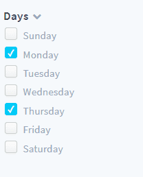
    alt text

    To generate a component, you can use our pre-build script by running the command below:

    yarn generate

    Select the component generator, name it DynamicParameterCheckbox and answer "No" to the last question as shown below:

    alt text
    Warning

    It is important that your component name starts with DynamicParameter to register it as a dynamic parameter

    This script generates a folder in src/components containing three files :

    • DynamicParameterCheckbox.jsx
    • DynamicParameterCheckbox.less
    • index.js

    Declare a component

    Before you start working on the component itself let's take a minute to see how to declare it and use it.

    Follow these steps to declare the new component:

    • Go to src/components/index.js

    • Import the component by adding this line at the top of the file :

      import DynamicParameterCheckbox from "./DynamicParameterCheckbox";
    • Declare it by adding its name to the components object

        components: {
            ...
            DynamicParameterCheckbox
      },

    You can now call this component in your configuration files by specifying its alias. To obtain a component alias, transform its name from camelCase to kebab-case (DynamicParameterCheckbox becomes dynamic-parameter-checkbox), then remove "dynamic-parameter" and/or "chart" from it.

    Here, the component's alias is checkbox. Now go to config/menus/sidebar.json and change the component property of dynamic-weekday to "checkbox" (i.e. the alias).

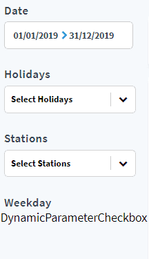
    Go to your application page, notice that the dynamic-weekday component has changed.
    alt text

    Don't worry if it doesn't work right now, its behavior will be set in the next section.

    Edit a component

    The framework used in this guide is going to be React.

    Info

    We will guide you step by step to make your components, but if you are having any trouble because you are not familiar with this framework you can check the documentation here. 🆘

    Also, since we are working with functional components, we will use one of latest features available, React Hooks. You can check this page for more information.

    Let's start editing DynamicParameterCheckbox.jsx

    Since this component is declared as a dynamic-parameter, some props are already automatically passed to it by Platforms data flow logic. These props can be logged when the component renders the first time, by making use of the useEffect hook.

    Start by importing useEffect and useState (you will need this one later) by changing the first line of the file:

    import React, { useEffect, useState } from 'react'

    Then add props to the arguments of the functional component:

    const DynamicParameterCheckbox = (props) => {

    Finally, add the useEffect hook inside this function right before the return statement.

    Your functional component should be defined as below:

    const DynamicParameterCheckbox = (props) => {
      useEffect(() => {
        console.log(props);
      }, []);
    
      return <div>DynamicParameterCheckbox</div>;
    };

    Open your browser's console panel, you should be able to see the props.

    alt text

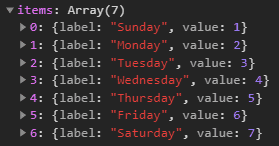
    As you can see, most of these props are passed in sidebar.json when defining the dynamic-parameter.
    The only exception is items which is the result of an internal request querying the field specified in dictionary (week_day in this case)
    alt text

    Now let's create the checkboxes.

    To achieve this, you will need to install a small package: react-checkbox-group. Do so by running:

    yarn add react-checkbox-group

    This package allows you to use a checkbox group component. You can now import it by adding this line at the top of the file:

    import CheckboxGroup from 'react-checkbox-group'

    Add a boolean variable expanded to the component state to be able to display or hide the CheckboxGroup with a little arrow icon:

    const DynamicParameterCheckbox = (props) => {
      const [expanded, setExpanded] = useState(true)
      ...

    Change the function return statement like this:

    return (
      <div>
        <div className='dyn-title checkbox-header'>
          {props.title}
          <i onClick={() => setExpanded(!expanded)} className={`fa fa-chevron-${expanded ? 'down' : 'right'} expand-icon`} /></div>
        {expanded && <CheckboxGroup name='options'>
          {(Checkbox) => (
            <React.Fragment>
              {props.items.map(option =>
                <div key={option.value}>
                  <label className='dyn-checkbox-container' htmlFor={option.value}>
                    <Checkbox className='dyn-checkbox' id={option.value} value={option.value} />
                    <span className='dyn-checkbox-label'>{option.label}</span>
                  </label>
                </div>)}
            </React.Fragment>
          )}
        </CheckboxGroup>}
      </div>
    )

    The title section is using props.title. This means that you need to pass a title prop in dynamic-weekday definition in config/menus/sidebar.json, as shown below: (the HTML element has also been removed since it's now redundant)

    {
      "id": "dyn-weekday",
      "items": [
        {
          "type": "dynamic-parameter",
          "dynamic-parameter": {
            "type": "filter",
            "id": "dynamic-weekday",
            "dictionary": "week_day_label",
            "component": "checkbox",
            "title": "Days"
          },
          "style": {
            "paddingBottom": "10px"
          }
        }
      ]
    }

    Finally, style your component by changing DynamicParameterCheckbox.less, using the code snippet below.

    DynamicParameterCheckbox.less
    // DynamicParameterCheckbox stylesheet
    
    @import "../../styles/_variables.less";
    
    .checkbox-header {
      display: flex;
      flex-direction: row;
      align-items: center;
    }
    
    .dyn-checkbox-container {
      display: flex;
      align-items: flex-end;
      margin: 3px;
    }
    
    .dyn-checkbox {
      -webkit-appearance: none;
      background-color: #fafafa;
      border: 1px solid #cacece;
      box-shadow: 0 1px 2px rgba(0, 0, 0, 0.05), inset 0px -15px 10px -12px rgba(0, 0, 0, 0.05);
      padding: 7px;
      border-radius: 3px;
      display: inline-block;
      position: relative;
    }
    
    .dyn-checkbox:hover {
      cursor: pointer;
      box-shadow: 0 1px 2px @primary-color, inset 0px 1px 3px @primary-color;
      border: 1px solid @primary-color;
    }
    
    .dyn-checkbox:active,
    .dyn-checkbox:checked:active {
      box-shadow: 0 1px 2px @primary-color, inset 0px 1px 3px @primary-color;
    }
    
    .dyn-checkbox:checked {
      background-color: @primary-color;
      border: 1px solid @primary-color;
      box-shadow: 0 1px 2px @primary-color, inset 0px -15px 10px -12px
          @primary-color, inset 15px 10px -12px @primary-color;
      color: white;
    }
    
    .dyn-checkbox:checked:after {
      content: "\2714";
      font-size: 12px;
      position: absolute;
      top: -1px;
      left: 2px;
      color: white;
    }
    
    .dyn-checkbox-label {
      cursor: pointer;
      font-family: "Source Sans Pro";
      font-size: 14px;
      letter-spacing: 0;
      color: #97a7b7;
      line-height: 17px;
      margin-left: 5px;
    }
    
    .fa.expand-icon {
      color: #97a7b7;
      font-size: 12px;
      cursor: pointer;
      margin-left: 5px;
    }
    
    .fa.expand-icon:hover {
      color: #3e4550;
      cursor: pointer;
    }

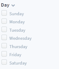
    Your dynamic-parameter looks good now, but it's not working properly yet.
    alt text

    There is a problem, you cannot check any box!

    The reason is that you need to bind CheckboxGroup to our dynamic-parameter component. To do so, you have to add an array to the state of your component. It will keep track of the selected options, so name it selectedOptions:

    const DynamicParameterCheckbox = (props) => {
      const [expanded, setExpanded] = useState(true)
      const [selectedOptions, setSelectedOptions] = useState([])
      ...

    Add a function onChange to update the array you have just defined:

    const onChange = options => {
      setSelectedOptions(options);
    };

    Finally, you need to add the two properties (onChange and value, an array containing selectedOptions) to CheckboxGroup. Bind them by changing the return statement:

    return (
      ...
      <CheckboxGroup name='options' value={selectedOptions || []} onChange={onChange}>
      ...

    Almost there! 🚴‍♂️

    The last step is to bind this dynamic-parameter to the redux global store to allow it to affect charts requests. We'll use React Redux hooks for a more modern and streamlined approach. Add these lines to the imports at the top of the file:

    import { useSelector, useDispatch } from 'react-redux'
    import { set } from 'forepaas/store/querystring/action'

    Next, inside your DynamicParameterCheckbox functional component, access the Redux state and dispatch function using hooks. Place these lines, inside your component function:

    const options = useSelector((state) => state.querystring[props.id])
    const dispatch = useDispatch()
    • useSelector: This hook allows you to extract data from the Redux store state. Here, we're fetching the value associated with props.id from the querystring part of your Redux state. This options variable will automatically update whenever the Redux state changes for this specific ID.

    • useDispatch: This hook returns a reference to the dispatch function from the Redux store. You'll use this dispatch function to send actions to update the store.

    Inside your DynamicParameterCheckbox functional component, create a helper function updateModel to dispatch your actions to the global store:

    const updateModel = (model) => {
      if (props.id) {
        let value = (model || []).map((item) => item && item.value ? item.value : item)
        dispatch(set(props.id, value.length ? value : null))
      }
    }

    This function now uses the dispatch function obtained from useDispatch to send the set action, updating the querystring in the Redux store.

    Then, update your onChange function to simply call updateModel with the new options:

    const onChange = (options) => {
        updateModel(options)
      }

    To ensure your component's internal state (selectedOptions) is synchronized with the Redux store's state (especially after a page refresh or external changes to the Redux state for this parameter), update your useEffect hook like this:

    useEffect (() => {
        setSelectedOptions(options)
      }, [options])

    This useEffect hook will run whenever the options value (which comes directly from your Redux store via useSelector) changes. It keeps your component's local selectedOptions state in sync with the global Redux state, providing a consistent view of the dynamic parameter.

    Your dynamic parameter is now connected to the global store. You can make sure of this because the charts connected to dynamic-weekday are affected by this dynamic parameter.

    You have created your first custom dynamic parameter.
    If you got lost 😪along the way, no worries. You can find the final code here.

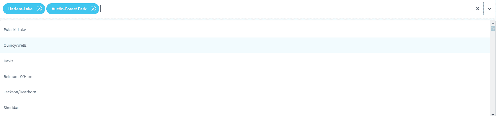
    Let's add a second dynamic parameter to be able to filter by station.
    alt text

    Generate a new component:

    yarn generate

    Select the component generator. Name it DynamicParameterAutocompleteBox and answer "No" to the last question.

    Change the content of the newly generated .jsx file to this:

    DynamicParameterAutocompleteBox.jsx
    import React, { useState, useEffect } from 'react'
    import Select, { createFilter }  from 'react-select'
    import { useSelector, useDispatch } from 'react-redux'
    import { set } from 'forepaas/store/querystring/action'
    
    const searchIcon = () => ({
      alignItems: 'center',
      display: 'flex',
      ':before': {
        fontFamily: 'FontAwesome',
        content: '"\f002"',
        marginRight: 8
      }
    })
    
    const customStyles = {
      control: (base, state) => ({
        ...base,
        height: '57px',
        borderWidth: '0px',
        boxShadow: '5px 5px -2px rgba(0, 0, 0, 0.1)'
      }),
      option: (base, state) => ({
        ...base,
        color: state.theme.colors.neutral50,
        fontSize: '13px',
        height: '48px',
        display: 'flex',
        alignItems: 'center',
        fontWeight: 500,
        letterSpacing: 0
      }),
      menu: (base, state) => ({
        ...base,
        zIndex: 2000
      }),
      multiValue: (base, state) => ({
        ...base,
        borderRadius: '21px',
        backgroundColor: state.theme.colors.primary75,
        color: state.theme.colors.neutral0,
        height: '34px',
        alignItems: 'center'
      }),
      multiValueLabel: (base, state) => ({
        ...base,
        color: state.theme.colors.neutral0,
        display: 'flex',
        alignItems: 'center',
        marginLeft: '10px',
        fontWeight: 600,
        letterSpacing: 0
      }),
      placeholder: (base, state) => ({
        ...base,
        color: state.theme.colors.neutral20,
        fontSize: '14px',
        ...searchIcon()
      }),
      multiValueRemove: (base, state) => {
        return ({
          ...base,
          color: state.theme.colors.neutral0,
          borderRadius: '10px',
          padding: '0px',
          margin: '10px',
          border: `1px solid ${state.theme.colors.neutral0}`,
          ':hover': {
            backgroundColor: state.theme.colors.neutral0,
            color: state.theme.colors.primary75,
            cursor: 'pointer'
          }
        })
      }
    
    }
    
    const DynamicParameterAutocompleteBox = ({ items, ...props }) => {
      const [selectedOptions, setSelectedOptions] = useState([])
      const selectedValues = useSelector((state) => state.querystring[props.id])
      const dispatch = useDispatch()
      items.sort((a,b) => (a.label > b.label) ? 1 : ((b.label > a.label) ? -1 : 0))
    
      const customTheme = theme => ({
        ...theme,
        colors: {
          ...theme.colors,
          primary: props.primaryColor || '#00CCF9',
          primary25: props.primary25Color || 'rgba(16,182,233,0.06)',
          primary50: props.primary50Color || 'rgba(16,182,233,0.20)',
          primary75: props.primary75Color || 'rgba(16,182,233,0.8)',
          neutral20: props.placeholderColor || '#97A7B7',
          neutral50: props.menuColor || '#485465'
        }
      })
    
      useEffect (() => {
        const mappedOptions = items.filter(item => (selectedValues || []).includes(item.value))
        setSelectedOptions(mappedOptions)
      }, [selectedValues, items])
    
      const updateModel = (model) => {
        if (props.id) {
          let values = (model || []).map((item) => item && item.value ? item.value : item)
          dispatch(set(props.id, values.length ? values : null))
        }
      }
    
      const onChange = (options) => {
        if (options && !Array.isArray(options)) {
          options = [options]
        }
        updateModel(options)
      }
    
      return (
        <Select 
          value={selectedOptions || []} 
          styles={customStyles} theme={customTheme} 
          options={items} 
          isMulti={props.isMulti}
          placeholder={props.placeholder}
          onChange={onChange} 
          autoFocus={true}
          isClearable={true}
          isSearchable={true}
          pageSize={10}
          closeMenuOnSelect={true}
          filterOption={createFilter({ignoreCase: true, ignoreAccents: true, trim: true, matchFrom: 'start'})}
        />
      )
    }
    
    export default DynamicParameterAutocompleteBox

    Declare it in src/components/index.js by importing your new component and adding it to the components object defined in the file.

    Go to config/dashboards/rides-analytics.json, look for the panel whose id is search-bar and replace it with a dynamic-parameter as such:

    {
      "type": "dynamic-parameter",
      "id": "search-bar",
      "dynamic-parameter": {
        "type": "filter",
        "id": "dynamic-stations",
        "component": "autocomplete-box",
        "placeholder": "Search for a station",
        "isMulti": true,
        "dictionary": "station_name"
      },
      "sizeX": 100,
      "sizeY": 19,
      "col": 0,
      "row": 0,
      "items": []
    }

    Finally, remove the whole dyn-stations object from config/menus/sidebar.json, as it is redundant with the new search bar.

    Use a custom component as a chart

    In this section, you will learn how to create a custom component and how to use it as a chart.

    As an example, you will create an interactive map component using react-leaflet library. The final result will look like this:
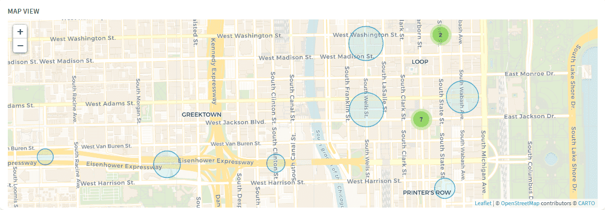
    alt text

    Let's start by creating the component using the script as usual.

    yarn generate

    Select the component generator, name it ChartMap and answer "No" to the last question.

    Warning

    It is important that your chart component name starts with 'Chart', so it is recognized and registered properly.

    Declare it in src/components/index.js.

    You can now use it in your analytics dashboard. Go to rides-analytics.json, and add the new chart and its title to the custom-map panel:

    {
      "type": "panel",
      "id": "custom-map",
      "sizeX": 75,
      "sizeY": 99,
      "row": 20,
      "col": 0,
      "items": [
        {
          "type": "html",
          "content": "Map view",
          "customclass": "chart-title",
          "sizeX": 100,
          "sizeY": 5
        },
        {
          "type": "chart",
          "chart": {
            "id": "chart-map",
            "component": "map",
            "dynamic-parameters": [
              "dynamic-date",
              "dynamic-holidays",
              "dynamic-stations",
              "dynamic-weekday"
            ],
            "request": {
              "data": {
                "fields": {
                  "rides": ["avg"]
                }
              },
              "scale": {
                "fields": ["station_id", "station_name", "lat", "lng"]
              },
              "filter": {},
              "order": {}
            }
          },
          "sizeX": 100,
          "sizeY": 88,
          "row": 6,
          "col": 0
        }
      ]
    }
    alt text

    Like dynamic-parameters, charts also automatically receive some properties when they are mounted. Let's see what they look like.

    As usual, import useEffect and useState by changing the first line of the ChartMap.jsx file:

    import React, { useState, useEffect } from 'react'

    Then add props to the arguments of the functional component:

    const ChartMap = (props) => {

    Finally, add a useEffect hook inside this function right before the return statement.

    Your final functional component should look like this:

    const ChartMap = (props) => {
      useEffect(() => {
        console.log(props);
      }, []);
      return <div>ChartMap</div>;
    }

    Open your browser's console panel, you should be able to see the props passed to this component.

    alt text

    Most of these props come from the chart definition in config/dashboards/rides-analytics.json.
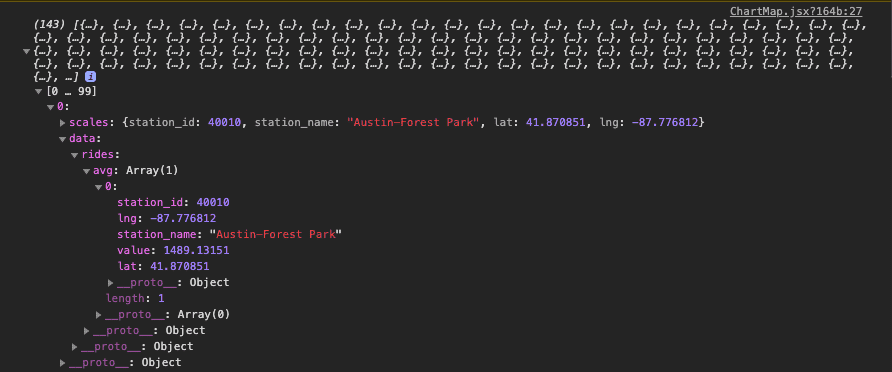
    The exception is data which is a JSON representing the result of the request associated with the chart. This JSON is meant to be as generic as possible, so it can be a bit tedious to manipulate.
    alt text

    In this example -- and in most cases -- the JSON object is too complex so we use this helper function to flatten it and make it way easier to handle:

    const flattenChartResults = results => {
      let flattenedChartResults = [];
      results.forEach(result => {
        let fieldEntries = [];
        Object.entries(result.data).forEach(([fieldName, computeModes]) => {
          Object.entries(computeModes).forEach(([computeModeName, rows]) => {
            computeModeName === "select"
              ? fieldEntries.push([computeModeName, rows[0].value])
              : fieldEntries.push([
                  `${fieldName}_${computeModeName}`,
                  rows[0].value
                ]);
          });
        });
        let flattenedObject = {
          ...result.scales,
          ...Object.fromEntries(fieldEntries)
        };
        flattenedChartResults.push(flattenedObject);
      });
      return flattenedChartResults;
    }

    Copy and paste the code snippet above between imports and ChartMap, then update your useEffect hook content to visualize the new flattened results:
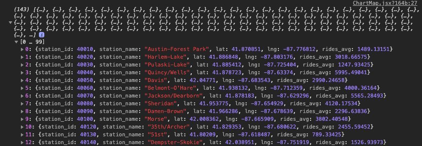
    useEffect(() => {
      const results = flattenChartResults(props.chart.data.results);
      console.log(results);
    }, [props.chart.data.results]);
    alt text

    To display these results on the map, you need to store this data in the component's state. Declare an array inside the ChartMap component like this:

    const ChartMap = (props) => {
      const [stations, setStations] = useState([])
      ...

    Update useEffect to change this array instead of logging the results:

    useEffect(() => {
      const results = flattenChartResults(props.chart.data.results);
      setStations(results);
    }, [props.chart.data.results]);

    Now that you've prepared the data, let's see now how to make the map.

    Now import react-leaflet components by adding this line to the top of your file:

    import { Map as LeafletMap, CircleMarker, Popup, TileLayer } from 'react-leaflet'

    Go to ChartMap.less and change the stylesheet using the code snippet below:

    ChartMap.less
    // ChartMap stylesheet
    @import "~leaflet/dist/leaflet.css";
    @import "~react-leaflet-markercluster/dist/styles.min.css";
    
    .leaflet-container {
      height: 100%;
    }
    
    .leaflet-popup-content-wrapper,
    .leaflet-popup-tip {
      opacity: 0.85;
      background-color: #3e4550;
      box-shadow: inset 0 -3px 0 0 rgba(0, 0, 0, 0.13);
      color: #fff;
    }
    
    .leaflet-popup-content-wrapper {
      text-align: center;
      border-radius: 1px;
    }
    
    .popup-title {
      letter-spacing: 0;
      font-size: 13px;
    }
    
    .popup-value {
      font-size: 13px;
      font-weight: 600;
    }

    Go back to ChartMap.jsx and define your default map parameters (center, zoom, minZoom) right below your state:

    const center = [41.89, -87.6297982]
    const zoom = 14
    const minZoom = 7

    Change your function return statement to display an empty map centered on Chicago:
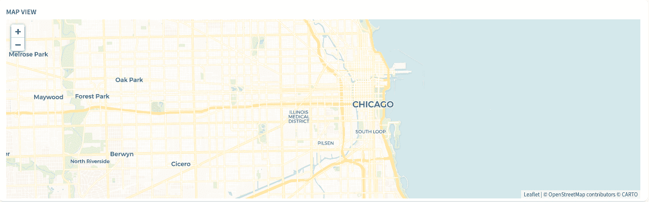
    return (
      <LeafletMap center={center} zoom={zoom} minZoom={minZoom}>
        <TileLayer
          attribution='&copy; <a href="https://www.openstreetmap.org/copyright">OpenStreetMap</a> contributors &copy; <a href="https://carto.com/attributions">CARTO</a>'
          url="https://{s}.basemaps.cartocdn.com/rastertiles/voyager/{z}/{x}/{y}{r}.png"
        />
      </LeafletMap>
    )
    alt text

    Now add circle markers inside LeafletMap right below the TileLayer to represent stations:

    {
      stations.map(station => (
        <CircleMarker
          key={station.station_id}
          center={[station.lat, station.lng]}
        />
      ))
    }
    Info

    You can customize your circle markers by adding some props to control their size, their weight, their color, etc. You can find the complete documentation here

    Below a code snippet changing the circles' color and making their size proportional to the rides.

    <CircleMarker
      key={station.station_id}
      center={[station.lat, station.lng]}
      radius={Math.max(
        10 + (station.rides_avg / 1000) * Math.log(zoom),
        ((2 * station.rides_avg) / 1000) * Math.log(zoom)
      )}
      color={"#0089C0"}
      weight={1}
      fillColor={"rgba(0,204,249,0.5)"}
    />

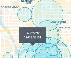
    Next, add a popup to display the station name and the number of rides associated to it when clicking a circle.

    Add it inside CircleMarker as shown below:
    <CircleMarker
      key={station.station_id}
      center={[station.lat, station.lng]}
      radius={Math.max(
        10 + (station.rides_avg / 1000) * Math.log(zoom),
        ((2 * station.rides_avg) / 1000) * Math.log(zoom)
      )}
      color={"#0089C0"}
      weight={1}
      fillColor={"rgba(0,204,249,0.5)"}
    >
      <Popup closeButton={false} position={[station.lat, station.lng]}>
        <div className="popup-title">{station.station_name}</div>
        <div className="popup-value">{station.rides_avg}</div>
      </Popup>
    </CircleMarker>
    alt text

    You can make the average number of rides follow the formatting rules specified in config/formatter.json for rides by using FpMeasure.
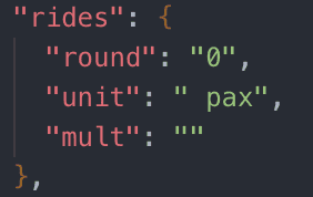
    alt text

    Import FpMeasure:

    import { FpMeasure } from 'forepaas/formatter'

    Change the popup value:

    <div className="popup-value">
      {new FpMeasure("rides").setValue(station.rides_avg).toString()}
    </div>

    If you play a little with your map, you will notice that it keeps reloading when you change your dynamic parameters. You can disable this behavior by adding a noReload property into your chart configuration options in config/dashboards/rides-analytics.json:

    "chart": {
      "id": "chart-map",
      "component": "map",
      "noReload": true,
      "dynamic-parameters": [
        ...
      ],
      "request": {
        ...
      }
    },

    Reorganize your circles by clusters to avoid overlapping, it's pretty straightforward thanks to the react-leaflet-markercluster library.

    Import the MarkerClusterGroup component:

    import MarkerClusterGroup from 'react-leaflet-markercluster'

    Then wrap your circle markers in MarkerClusterGroup like this:

    <MarkerClusterGroup showCoverageOnHover={false}>
      {stations.map(station => (
        <CircleMarker
          ...
        </CircleMarker>
      ))}
    </MarkerClusterGroup>

    You have created your first custom component.
    If you got lost, don't worry. You can find the final code here.

    Info

    Learn more about creating your custom components in the Technical Guide!

    Publish your local app on Data Platform

    Now that you've completed your app locally, it's time to plug it into the platform.
    You can either do it by uploading the app as a zip file, or by connecting it to a git repository.

    Import your app as a zip file

    First, you need to export your app as a zip. Your zipped file should not contain the following folders: node_modules, forepaas, webpack, .git.
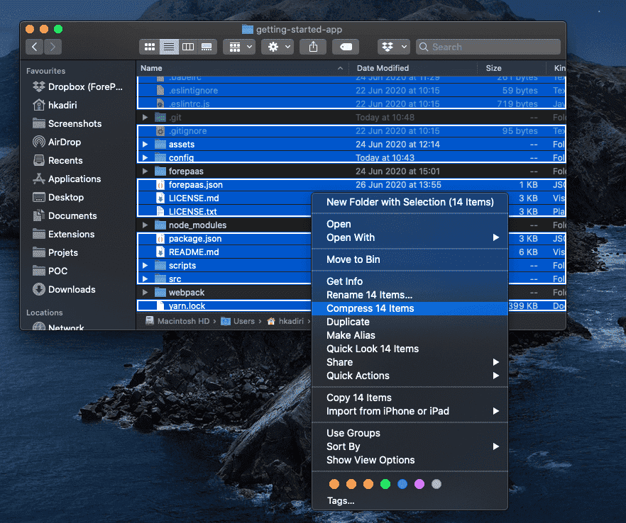
    alt text

    You can also use our pre-build script to zip your app, to generate a zip file ready to be uploaded to your Project, simply run this command.

    yarn zip

    A zip file with the same name as your application folder will be generated.

    Then, you can either create a new application using this .zip file by following these steps or you can edit an existing application and upload the zip file to create a new version of your application:
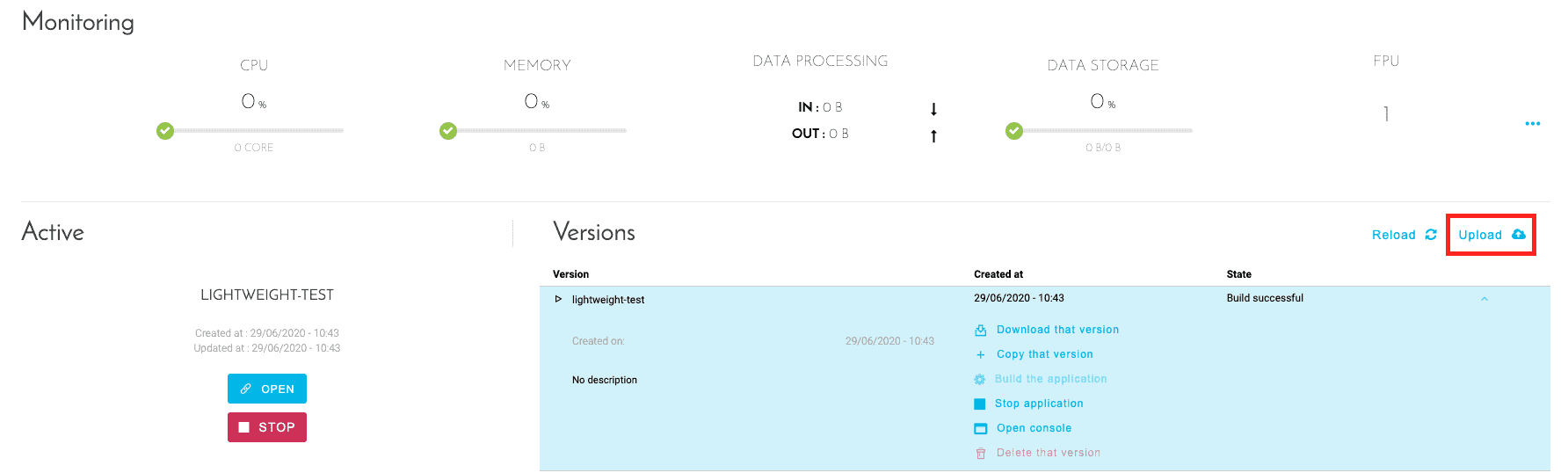
    alt text

    Connect your app to a git repository

    To link a git repository to the platform, please follow this guide.

    Once your app is uploaded, build it then deploy it.
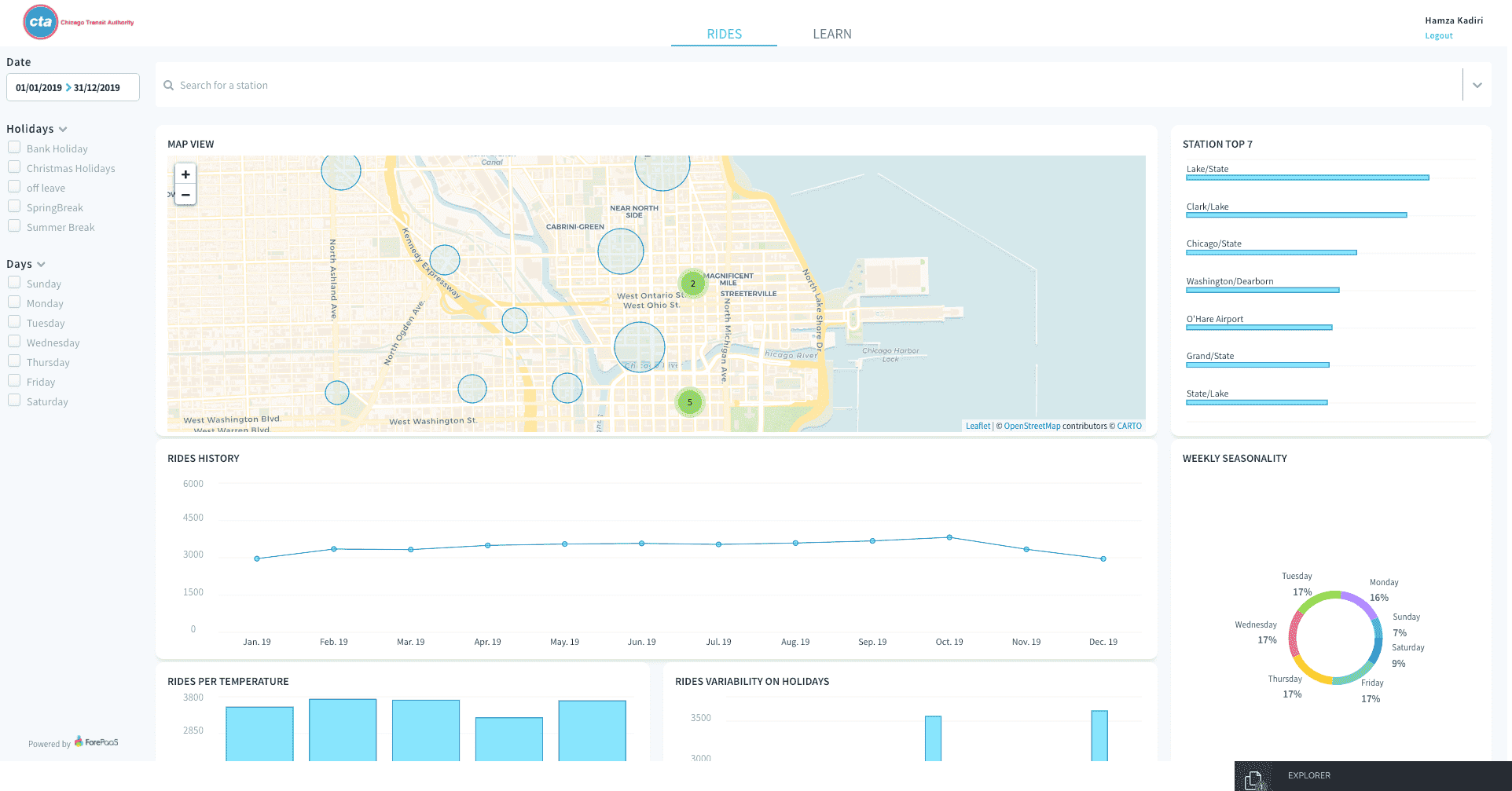
    alt text

    Your fancy app is now deployed on Data Platform!

    Go further

    If you need training or technical assistance to implement our solutions, contact your sales representative or click on this link to get a quote and ask our Professional Services experts for a custom analysis of your project.

    Ask questions, give your feedback and interact directly with the team building the Data Platform on the dedicated Discord channel.

    If you need support with your OVHcloud services, create a request in our Help Centre.

    Join our community of users.